top of page


[Luminess]
[Bringing beauty-tech to life]
Industry
Consumer Tech
Systems
‣ Brand Identity
‣ 3D Modeling
‣ Rapid Prototyping
‣ Product Visualization
Credits
‣ Creative Direction: Luminess Creative Leadership
‣ Design & Execution: Luminess Design Team
‣ In-house contribution under Jess Russi

The initial challenge was a full brand refresh for Luminess Cosmetics to reflect its evolution toward a cleaner, more refined identity. The core problem was to make a tech-heavy beauty brand feel elegant and simple, rather than overwhelming. This required the creation of a new emblem and a cohesive visual system that could extend seamlessly across product, packaging, digital platforms, and motion graphics.
The team realized that a strong visual system could effectively bridge storytelling and product development. By shifting from early collage-based maximalism to a more minimal, product-centered aesthetic, they discovered that embedding the brand's identity directly into the physical details of the products would allow the technology to shine. Through clarity, restraint, and carefully considered interaction design, the tech-heavy products could feel sophisticated and accessible.
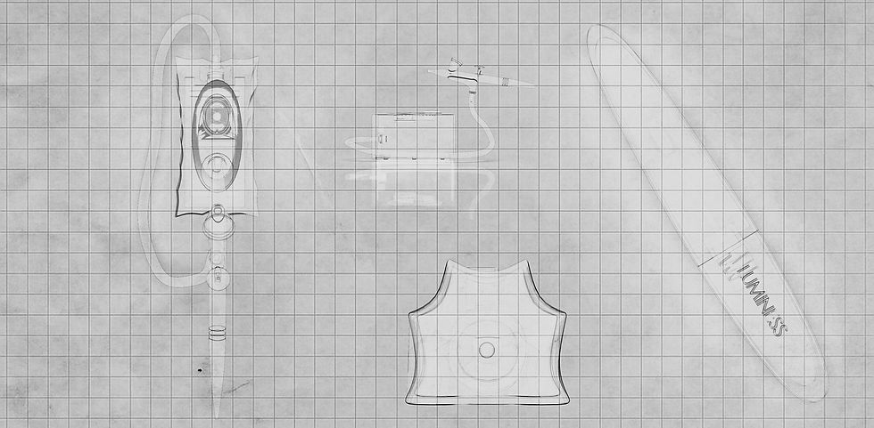
The journey began with a review of the existing logo, leading to the creation of a new icon: two mirrored “L”s forming a clean rectangle to convey balance, sophistication, and symmetry. To bring this to life, the team shifted their workflow to introduce 3D modeling and product visualizations.

The new product design was a meticulous, hands-on process that involved designing, 3D printing, and testing each iteration. The team focused on refining the look and feel by experimenting with intentional design choices like scalloped contours, magnetic attachments, and premium materials such as glass and metallic finishes.
Introducing in-house prototyping was a necessity, as it turned the design process into a real-time physical feedback loop. This allowed the team to test ideas physically and ensure that decisions were firmly rooted in both brand aesthetics and practical usability.

A complete, unified visual system and new brand emblem that worked seamlessly across campaign assets, packaging, digital, and motion graphics without competing with the products themselves.
The new identity was deeply embedded into the brand's physical language, with the emblem directly etched into products and pressed into packaging. By layering materials and playing with surfaces, the team created a sophisticated overlay effect that added depth, tactility, and a quiet sense of luxury to every product.

The rebrand successfully established a clean, clear, and instantly recognizable identity for Luminess in a crowded beauty tech market. By making the technology feel elegant and not overwhelming, the final cohesive system gave the brand a sophisticated foundation for its future growth.
bottom of page